Your Messages, Phone, and Contacts icons are about to look different

Google has started rolling out new app icons for Google Messages, Phone, and Contacts on Android.
Last year, Google updated its iconic "G" logo with a new gradient look, which the company said represented its shift toward an AI-first era. Earlier this year, Google brought a similar design to nearly all of its Workspace apps, including Gmail, Drive, Docs, Calendar, and more. And now, it looks like Google is bringing that same design treatment to some of Android's most-used apps as well.
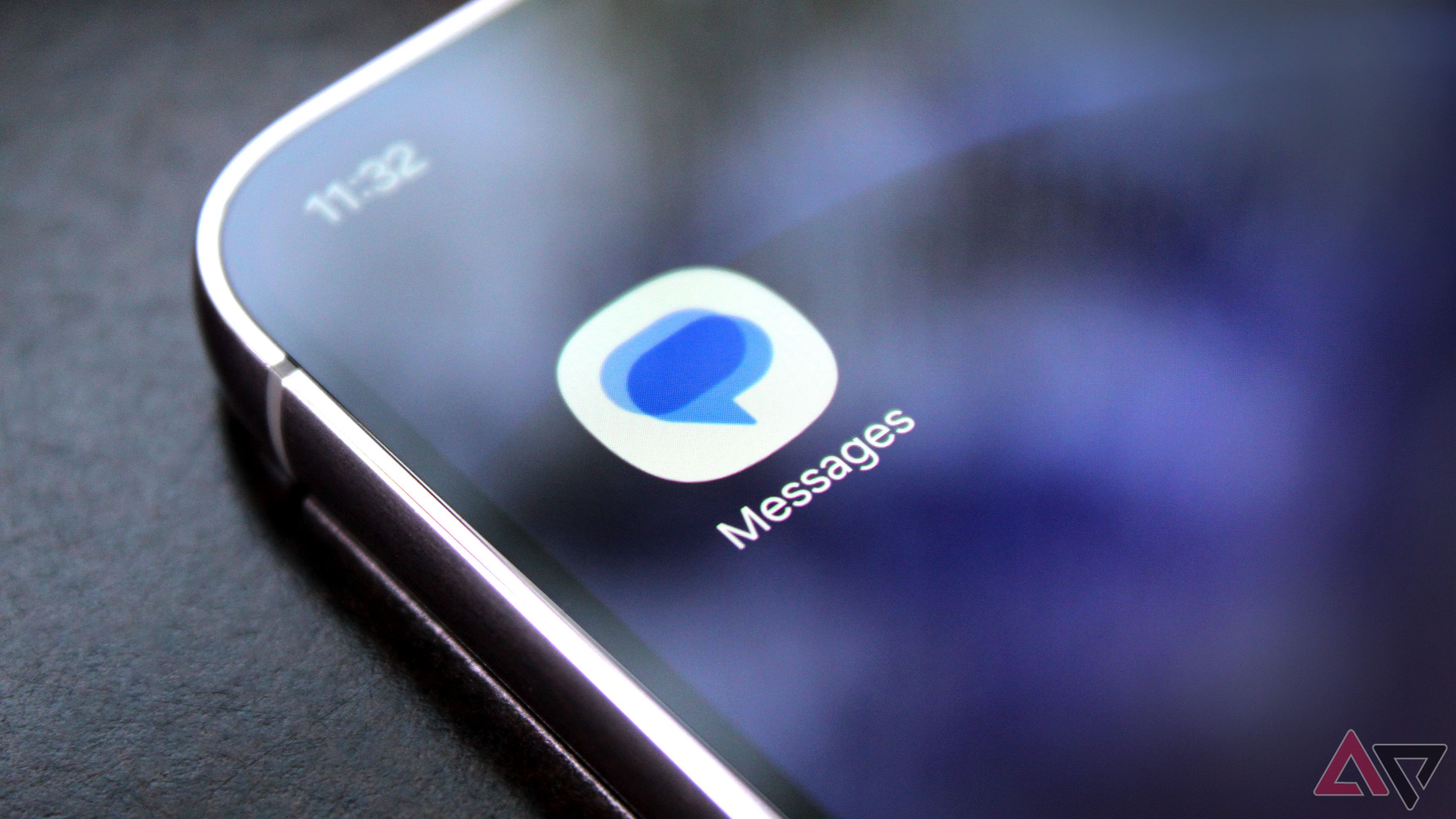
Google today announced that it's rolling out refreshed icons for three of its core Android apps: Google Messages, Phone, and Contacts. All three icons are getting the same gradient treatment we've seen on other Google apps recently. And while they don't look dramatically different from their previous versions, there are some subtle changes to the colors and overall design.
Google Messages, Phone, and Contacts are getting refreshed icons
Google says the new icons are designed to look sharper and clearer on your home screen. The company has added subtle gradients with more defined edges, while also tweaking the curvature and colors to better match the rest of its updated app icons.
The idea is to make these apps feel more consistent with Google's new design language, especially as more of its apps adopt the same gradient-heavy look.
Of course, the actual functionality of Messages, Phone, and Contacts isn't changing. You'll still get the same apps and features you're used to, with Google simply refreshing how their icons look on your home screen and app drawer.
Google says the new icons have already started rolling out to Android phones, although I haven't spotted them on my Pixel 11 Pro just yet. That said, with the rollout now underway, you should start seeing the refreshed icons on your Android phone over the coming days.
Source: Read original article

Comments ()