One UI 9.5 makes a big improvement to Samsung's Phone app
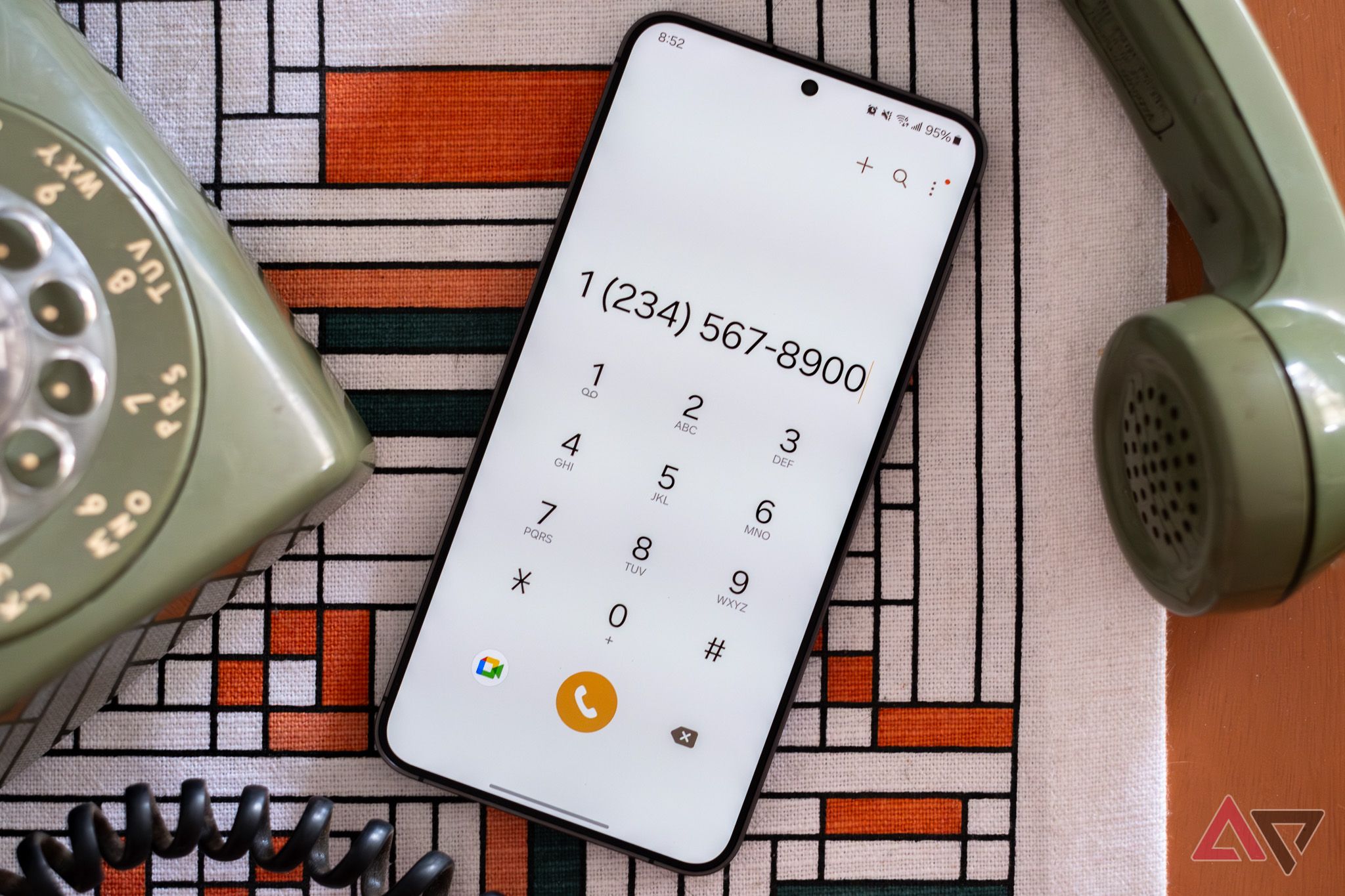
Samsung is making a small but welcome change to the Phone app in One UI 9.5, by moving the search bar (via Android Authority). According to these rumors, the search icon and bar will move from the top of the screen, to the bottom edge.
This may seem like a small and inconsequential change, but it's anything but. With phones getting larger and larger, having useful features within easy reach of your fingers is paramount to user-friendly design.
Samsung may move the Phone app's search bar
Sometimes the smallest changes are the best ones
Smartphones have been getting larger over the years, and as a result, some elements of the screen that used to be within easy reach are no longer. In fact, phones like the S26 Ultra have all but become two-handed devices for many.
Phones like the Z Fold 8 have helped, with their shorter builds and screens, but the true solution is designed smarter interfaces, rather than shrinking devices back down again.
It seems that Samsung agrees, as it's making changes to its Phone app in One UI 9.5.
In an updated version of One UI seen by SamMobile, the search icon in the Phone app has moved from the top-right of the screen, to the bottom-right, where it has been placed alongside the existing options.

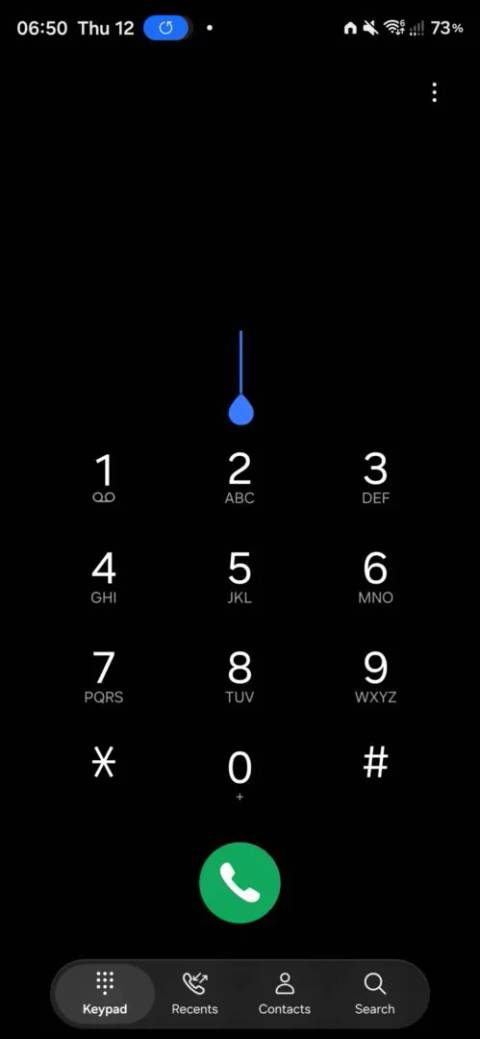
This is becoming a trend for Samsung, who is making sweeping changes across its apps of a similar nature. It hasn't been long since the Samsung Calendar app received a similar update, moving the search icon into a more advantageous position.
Some of the smaller details have also changed in the update, like the "Search" text on the empty box being changed to "What are you looking for?", but that's unlikely to be as helpful a change as the move itself.
Of course, moving the search icon is likely to only be the start of this sort of change. Since phones don't seem to be getting any smaller, the chances we will get more updates akin to this are high.
Personally, I welcome these changes strongly. Stretching to reach the top of a device with one hand has been tough for a long time, so it makes sense to bring key elements like search down lower, where they can be more easily accessed. With any luck, more apps will follow suit and change the standard search icon's position from the top to the bottom.
Source: Read original article

Comments ()